


Charleston and the Lowcountry are not defined by loudness, but by tone. The colors here whisper rather than shout—soft blues reflecting tidal creeks, pale greens washed by the sun, and muted purples that bloom for a season and then disappear. These hues are not invented; they’re inherited from the environment itself. To walk a Charleston street, stroll the marsh at dusk, or sit beneath a canopy of moss-covered oaks is to understand that color in the Lowcountry is emotional. It isn’t decorative—it is storytelling. And in many ways, that language is the foundation of the Harlestons aesthetic.
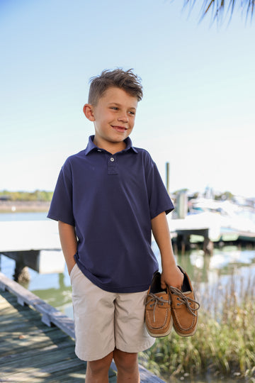
One of the most recognizable Lowcountry shades is the calm blue of the waterways—clear enough to reflect the sky, yet shaded with gray and green depending on the tide. This tone inspired Sea Island Blue, a color that captures the feel of salt air drifting across coastal courses and porches at twilight. Just like the marshes, the color doesn’t demand attention—it rewards those who notice nuance. It pairs effortlessly with neutrals, and its softness makes it wearable year-round, from morning rounds to evening dinners. It’s the kind of hue you don’t have to think about—it simply belongs.
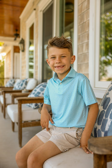
Then there’s the deeper, richer side of the Lowcountry palette: berry-washed purples and soft magentas you only notice when spring hits the city. This is the inspiration behind Dewberry, a color rooted in Charleston’s seasonal landscape and the elegant interiors of places like the Dewberry Hotel. Dewberry is subtle but confident, offering depth without flash, modernity without trend-chasing. It is ideal for the golfer who appreciates craft and isn’t afraid to express style through refined tones. In apparel form, it becomes a statement of quiet sophistication—a color with presence, not noise.
The Lowcountry palette extends well beyond the obvious coastal clichés. It includes muted cypress greens, oyster-shell grays, and the sandy beige of marsh paths baked in the summer heat. These are the backbone shades of Charleston’s identity: earth tones that weather gracefully and age beautifully. When applied to clothing, these colors are never temporary. They become staples—pieces that match any occasion and hold their relevance season after season. Harlestons pieces in these tones are intentionally understated, built to be worn often, and designed to elevate rather than compete.
What makes Lowcountry colors special isn’t just their aesthetic—it’s the philosophy behind them. They don’t represent status or flash. They represent restraint, maturity, and an appreciation for the environments that shape us. Golf demands the same mindset: patience, respect, and an understanding that subtle adjustments often matter more than dramatic swings. That is why Harlestons leans into the language of Lowcountry color. It’s not fashion for a moment—it’s style for a lifestyle, informed by the coast, refined by experience, and crafted so the wearer always feels at ease.